Naive Bayes Application: Penguins
Contents
Naive Bayes Application: Penguins#
References
Reference: The Bayes Rules Book.
prior reading of concept before this.
Dependencies#
import matplotlib.patches as mpatches
import matplotlib.pyplot as plt
import numpy as np
import pandas as pd
import seaborn as sns
from scipy import stats
from sklearn.metrics import accuracy_score
from sklearn import datasets, model_selection
from scipy.stats import multivariate_normal
from mpl_toolkits.mplot3d import Axes3D
import plotly.graph_objects as go
import torch
from scipy.stats import multivariate_normal
from rich import print

import sys
from pathlib import Path
parent_dir = str(Path().resolve().parents[3])
print(parent_dir)
sys.path.append(parent_dir)

from src.utils.plot import plot_scatter, plot_contour, plot_surface, plot_bar

sns.set_style('white')
/home/runner/work/gaohn-probability-stats/gaohn-probability-stats
Problem Statement#
There exist multiple penguin species throughout Antarctica, including the Adelie, Chinstrap, and Gentoo. When encountering one of these penguins on an Antarctic trip, we might classify its species
by examining various physical characteristics, such as whether the penguin weighs more than the average \(4200 \mathrm{~g}\),
as well as measurements of the penguin’s bill
The penguins_bayes data, originally made available by Gorman, Williams, and Fraser (2014) and distributed by Horst, Hill, and Gorman (2020), contains the above species and feature information for a sample of 344 Antarctic penguins:
penguins = sns.load_dataset('penguins')
display(penguins.head())
# penguins.head().style.set_table_attributes('style="font-size: 13px"')
| species | island | bill_length_mm | bill_depth_mm | flipper_length_mm | body_mass_g | sex | |
|---|---|---|---|---|---|---|---|
| 0 | Adelie | Torgersen | 39.1 | 18.7 | 181.0 | 3750.0 | Male |
| 1 | Adelie | Torgersen | 39.5 | 17.4 | 186.0 | 3800.0 | Female |
| 2 | Adelie | Torgersen | 40.3 | 18.0 | 195.0 | 3250.0 | Female |
| 3 | Adelie | Torgersen | NaN | NaN | NaN | NaN | NaN |
| 4 | Adelie | Torgersen | 36.7 | 19.3 | 193.0 | 3450.0 | Female |
display(penguins.info())
<class 'pandas.core.frame.DataFrame'>
RangeIndex: 344 entries, 0 to 343
Data columns (total 7 columns):
 #   Column             Non-Null Count  Dtype
---  ------             --------------  -----
 0   species            344 non-null    object
 1   island             344 non-null    object
 2   bill_length_mm     342 non-null    float64
 3   bill_depth_mm      342 non-null    float64
 4   flipper_length_mm  342 non-null    float64
 5   body_mass_g        342 non-null    float64
 6   sex                333 non-null    object
dtypes: float64(4), object(3)
memory usage: 18.9+ KB
None
display(penguins.describe())
| bill_length_mm | bill_depth_mm | flipper_length_mm | body_mass_g | |
|---|---|---|---|---|
| count | 342.000000 | 342.000000 | 342.000000 | 342.000000 |
| mean | 43.921930 | 17.151170 | 200.915205 | 4201.754386 |
| std | 5.459584 | 1.974793 | 14.061714 | 801.954536 |
| min | 32.100000 | 13.100000 | 172.000000 | 2700.000000 |
| 25% | 39.225000 | 15.600000 | 190.000000 | 3550.000000 |
| 50% | 44.450000 | 17.300000 | 197.000000 | 4050.000000 |
| 75% | 48.500000 | 18.700000 | 213.000000 | 4750.000000 |
| max | 59.600000 | 21.500000 | 231.000000 | 6300.000000 |
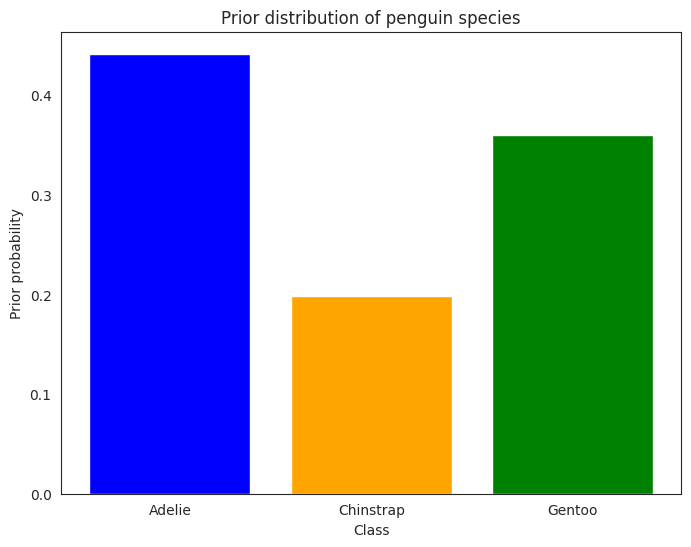
Among these penguins, 152 are Adelies, 68 are Chinstraps, and 124 are Gentoos. We’ll assume throughout that the proportional breakdown of these species in our dataset reflects the species breakdown in the wild. That is, our prior assumption about any new penguin is that it’s most likely an Adelie and least likely a Chinstrap:
display(penguins['species'].value_counts(normalize=False))
display(penguins['species'].value_counts(normalize=True))
Adelie       152
Gentoo       124
Chinstrap     68
Name: species, dtype: int64
Adelie       0.441860
Gentoo       0.360465
Chinstrap    0.197674
Name: species, dtype: float64
def missing_values_table(df: pd.DataFrame) -> pd.DataFrame:
    """Function to calculate missing values by column.

    credit: https://www.kaggle.com/willkoehrsen/start-here-a-gentle-introduction
    """
    # Total missing values per column
    missing_values_per_column = df.isnull().sum()

    # Percentage of missing values
    missing_values_per_column_percent = 100 * df.isnull().sum() / len(df)

    # Make a table with the results
    missing_value_table = pd.concat(
        [missing_values_per_column, missing_values_per_column_percent], axis=1
    )

    # Rename the columns
    missing_value_table_renamed = missing_value_table.rename(
        columns={0: "Missing Values", 1: "% of Total Values"}
    )

    # Sort the table by percentage of missing descending
    missing_value_table_renamed = (
        missing_value_table_renamed[missing_value_table_renamed.iloc[:, 1] != 0]
        .sort_values("% of Total Values", ascending=False)
        .round(1)
    )

    # Print some summary information
    print(
        f"Your selected dataframe has {str(df.shape[1])} columns.\n"
        f"There are {str(missing_value_table_renamed.shape[0])}"
        " columns that have missing values."
    )

    # Return the dataframe with missing information
    return missing_value_table_renamed
missing_values_table(penguins)
Your selected dataframe has 7 columns.
There are 5 columns that have missing values.
| Missing Values | % of Total Values | |
|---|---|---|
| sex | 11 | 3.2 |
| bill_length_mm | 2 | 0.6 |
| bill_depth_mm | 2 | 0.6 |
| flipper_length_mm | 2 | 0.6 |
| body_mass_g | 2 | 0.6 |
We drop sex column for simplicity as there are quite a few missing values in it.
penguins = penguins.drop(columns=["sex"], inplace=False).reset_index(drop=True)
We also drop the other NA rows for simplicity, there are only 2 of them and they turn out to be the same row.
penguins = penguins.dropna().reset_index(drop=True) # drop rows with NAs, only 2 rows
penguins
| species | island | bill_length_mm | bill_depth_mm | flipper_length_mm | body_mass_g | |
|---|---|---|---|---|---|---|
| 0 | Adelie | Torgersen | 39.1 | 18.7 | 181.0 | 3750.0 |
| 1 | Adelie | Torgersen | 39.5 | 17.4 | 186.0 | 3800.0 |
| 2 | Adelie | Torgersen | 40.3 | 18.0 | 195.0 | 3250.0 |
| 3 | Adelie | Torgersen | 36.7 | 19.3 | 193.0 | 3450.0 |
| 4 | Adelie | Torgersen | 39.3 | 20.6 | 190.0 | 3650.0 |
| ... | ... | ... | ... | ... | ... | ... |
| 337 | Gentoo | Biscoe | 47.2 | 13.7 | 214.0 | 4925.0 |
| 338 | Gentoo | Biscoe | 46.8 | 14.3 | 215.0 | 4850.0 |
| 339 | Gentoo | Biscoe | 50.4 | 15.7 | 222.0 | 5750.0 |
| 340 | Gentoo | Biscoe | 45.2 | 14.8 | 212.0 | 5200.0 |
| 341 | Gentoo | Biscoe | 49.9 | 16.1 | 213.0 | 5400.0 |
342 rows × 6 columns
display(penguins['species'].value_counts(normalize=False))
display(penguins['species'].value_counts(normalize=True))
Adelie       151
Gentoo       123
Chinstrap     68
Name: species, dtype: int64
Adelie       0.441520
Gentoo       0.359649
Chinstrap    0.198830
Name: species, dtype: float64
mean_body_mass_g = penguins['body_mass_g'].mean()
print(f"The mean body mass of penguins is {mean_body_mass_g:.2f} grams.")
The mean body mass of penguins is 4201.75 grams.
We create a new categorical feature overweight which is 1 if the body_mass_g is over the
mean, and 0 otherwise. This feature corresponds to our earlier defined random variable \(X_1\).
penguins["overweight"] = (penguins["body_mass_g"] > penguins["body_mass_g"].mean()).astype(int)
display(penguins["overweight"].value_counts())
0    193
1    149
Name: overweight, dtype: int64
The Prior#
The prior distribution for \(Y\) is a categorical distribution with three categories, one for each species. The prior probabilities are given by the relative frequencies of each species in the dataset:
which implies
Given a new penguin not in the dataset, the prior assumption says that the probability of it being an Adelie is \(0.44\), the probability of it being a Chinstrap is \(0.20\), and the probability of it being a Gentoo is \(0.36\).
We then map \(A \rightarrow 0\), \(C \rightarrow 1\), and \(G \rightarrow 2\) for convenience, as well as to allow us to plug these values for training.
Let us create a new column class_id which is 0 for Adelie, 1 for Chinstrap, and 2 for Gentoo.
penguins["class_id"] = penguins["species"].map({"Adelie": 0, "Chinstrap": 1, "Gentoo": 2})
display(penguins["class_id"].value_counts())
0    151
2    123
1     68
Name: class_id, dtype: int64
y = penguins["class_id"].values
def get_prior(y: torch.Tensor) -> torch.Tensor:
    if isinstance(y, np.ndarray):
        y = torch.from_numpy(y)
    probs = torch.unique(y, return_counts=True)[1] / len(y)
    distribution = torch.distributions.Categorical(probs=probs)
    return distribution
prior = get_prior(y)
print(f"The prior distribution is {prior.probs}")
The prior distribution is tensor([0.4415, 0.1988, 0.3596])
This indeed matches the prior probabilities (i.e. the relative frequencies of each species in the dataset).
class_names = ["Adelie", "Chinstrap", "Gentoo"]
class_colours = ['blue', 'orange', 'green']

fig, ax = plt.subplots(figsize=(8, 6))
bar = plot_bar(ax, x=class_names, y=prior.probs.numpy(), color=class_colours)
ax.set_xlabel("Class")
ax.set_ylabel("Prior probability")
ax.set_title("Prior distribution of penguin species")
plt.show()
Classifying one penguin#
Consider a new penguin with the following features:
body_mass_g: \(< 4200 \mathrm{~g}\) (overweight= 0 ifbody_mass_g\(< 4200 \mathrm{~g}\), 1 otherwise)bill_length_mm: \(50 \mathrm{~mm}\)flipper_length_mm: \(195 \mathrm{~mm}\)
Then we want to find out the posterior distribution of the species of this penguin, given the features. In other words, what is the probability of this penguin being an Adelie, Chinstrap, or Gentoo, given the features mentioned above.
One Categorical Feature#
Let us assume that we are building our Naive Bayes based off one categorical feature, overweight.
Then, since this penguin has a body_mass_g of \(< 4200 \mathrm{~g}\), it belongs to the category \(0\) of the feature overweight.
Let us call this feature \(X_1\), and the species \(Y\). Then we want to find out the posterior distribution of \(Y\), given \(X_1=0\).
Let’s reproduce the figure 14.1 from the book.
total = penguins.groupby("species").size().reset_index(name="counts")
overweight = (
    penguins[penguins["overweight"] == 1]
    .groupby("species")["overweight"]
    .sum()
    .reset_index()
)

overweight["overweight"] = [
    i / j * 100 for i, j in zip(overweight["overweight"], total["counts"])
]
total["counts"] = [i / j * 100 for i, j in zip(total["counts"], total["counts"])]

display(total)
display(overweight)  # percentage of overweight penguins for each species
| species | counts | |
|---|---|---|
| 0 | Adelie | 100.0 |
| 1 | Chinstrap | 100.0 |
| 2 | Gentoo | 100.0 |
| species | overweight | |
|---|---|---|
| 0 | Adelie | 16.556291 |
| 1 | Chinstrap | 10.294118 |
| 2 | Gentoo | 95.121951 |
# bar chart 1 -> top bars (group of 'overweight=No')
bar1 = sns.barplot(x="species", y="counts", data=total, color="darkblue")

# bar chart 2 -> bottom bars (group of 'overweight=Yes')
bar2 = sns.barplot(x="species", y="overweight", data=overweight, color="lightblue")

# add legend
top_bar = mpatches.Patch(color="darkblue", label="overweight = No")
bottom_bar = mpatches.Patch(color="lightblue", label="overweight = Yes")
plt.legend(handles=[top_bar, bottom_bar])

# show the graph
plt.show()
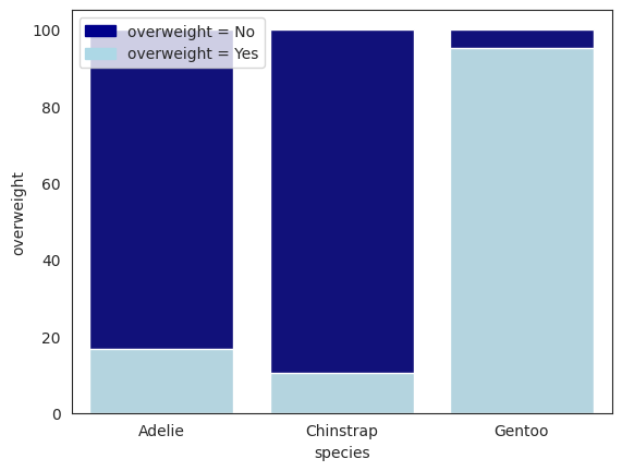
From the conditionals below, the Chinstrap species have the highest probability of underweight penguins by the relative freqeuncy table. That is, for each species, we compute the relative frequency within each species as
Note that we are abusing the notation \(\mathbb{P}\) here, since we are not talking about the true probability distribution, but rather the (empirical) relative frequency of feature \(X_1\) within each species \(Y=k \in \{A, C, G\}\).
The expressions above are the conditional probability of \(X_1=0\) given \(Y\) is a certain species, also termed as the likelihood of \(Y\) being a certain species given \(X_1=0\). Again, we are being loose with notation here as everything here is empirical!
So one might say that the Chinstrap species is the least likely to be overweight, and the Gentoo species is the most likely to be overweight. Well, this makes intuitive sense since we are talking about “likelihood” here: of all \(P(X_1=0|Y=A)\), \(P(X_1=0|Y=C)\), and \(P(X_1=0|Y=G)\), the Chinstrap species is the least likely to be overweight. This is because within the Chinstrap species, \(P(X_1=0|Y=C)\) is the highest, and therefore the complement \(P(X_1=1|Y=C)\) is the lowest.
Yet before we can make any conclusions, we need to take into account the prior probabilities of each species. We should weight the relative frequencies by the prior probabilities of each species. Intuitively, since Chinstrap is also the rarest species, it diminishes the likelihood of the penguin being a Chinstrap.
We need to use both the prior and the likelihood to compute the posterior distribution of the species of the penguin. The posterior distribution is the probability of the species of the penguin given the features.
For example, if our given feature of the test penguin is \(X_1=0\), then we need to find the posterior distribution of all species given \(X_1=0\). That is, we need to compute
and get the argmax of the above three expressions. The argmax is the species with the highest probability. Note this makes sense because \(\mathbb{P}[Y=y|X_1=x_1]\) is a legitimate probability measure over the sample space \(\Omega_Y = \{A, C, G\} = \{0, 1, 2\}\). Therefore, the argmax is the species with the highest probability in this sample space.
The argmax expression is as follows:
Note in the Bayes Rules Book, the authors used the notation \(f\) instead of \(\mathbb{P}\), they are the same thing in this context since both \(X_1\) and \(Y\) are discrete random variables. Consequently, the right hand side of the equation \(\mathbb{P}[X_1=x_1|Y=y]\) gives us a concrete value (the probability). However, if \(X_1\) were a continuous random variable, as we will see in the next section, then the expression \(\mathbb{P}[X_1=x_1|Y=y]\) would not make much sense since we the conditional probability of a continuous random variable at a point \(x_1\) is \(0\) by definition.
Let’s digress slightly:
We reconcile this by expressing Bayes Rule in terms of the probability density function (PDF) of the posterior distribution, see Bayes’ Rule forms.
The conditional PDF of the posterior distribution is
We make a bold statement (not proved here but true) now that the \(\hat{Y}\) that maximizes the posterior distribution in terms of Bayes Rules is the same as the \(\hat{Y}\) that maximizes the posterior distribution in terms of the conditional PDF.
If this statement is true, then finding the argmax of the posterior PDF is the same as finding the argmax of the posterior distribution in terms of Bayes Rule.
Let’s go back to where we left off.
The table below breaks down the joint distribution table of \(Y\) and \(X_1\), since both are categorical, it is easy to compute the joint distribution table.
\(Y\) |
\(X_1 = 0\) |
\(X_1 = 1\) |
\(\sum\) |
|---|---|---|---|
A |
126 |
25 |
151 |
C |
61 |
7 |
68 |
G |
6 |
117 |
123 |
\(\sum\) |
193 |
149 |
342 |
The below table represents the marginal distribution table of \(X_1\) in terms of the relative frequency.
\(Y\) |
\(X_1 = 0\) |
\(X_1 = 1\) |
\(\sum\) |
|---|---|---|---|
A |
0.365 |
0.072 |
0.437 |
C |
0.178 |
0.020 |
0.198 |
G |
0.017 |
0.342 |
0.359 |
\(\sum\) |
0.560 |
0.434 |
1.000 |
The image is a sketch of the joint distribution table of \(Y\) and \(X_1\).
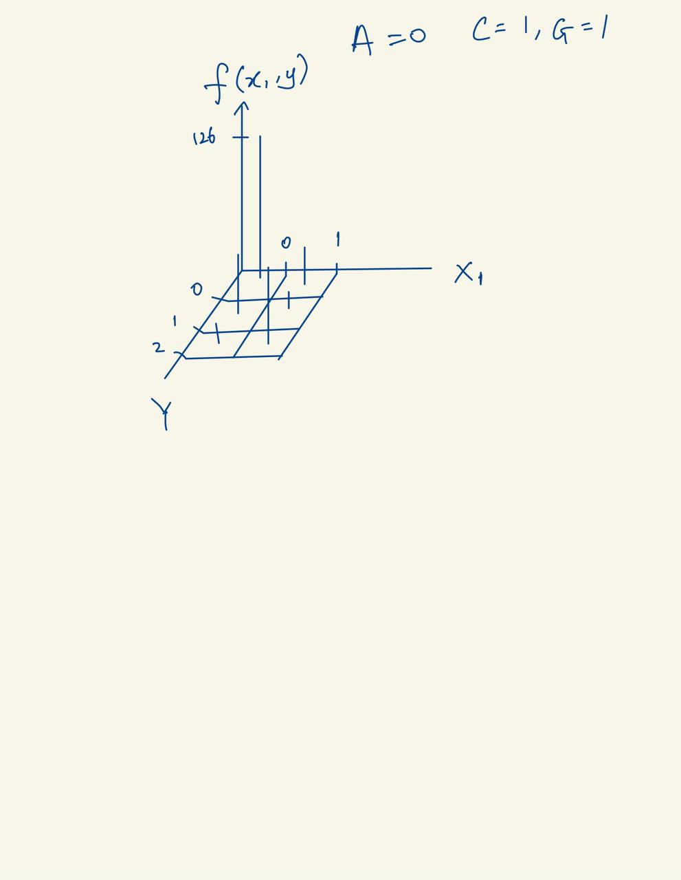
Fig. 24 Joint distribution diagram of \(Y\) and \(X_1\).#
We can also use seaborns jointgrid to do a joint distribution plot.
g = sns.JointGrid(data=penguins, x="overweight", y="species")
low, high = 0, 1
# bins =  np.arange(0, high + 1.5) - 0.5 # [-0.5, 0.5, 1.5]
g.plot_joint(sns.histplot,discrete=True, cbar=True, color="blue")
g.plot_marginals(sns.histplot, discrete=True, color="green");
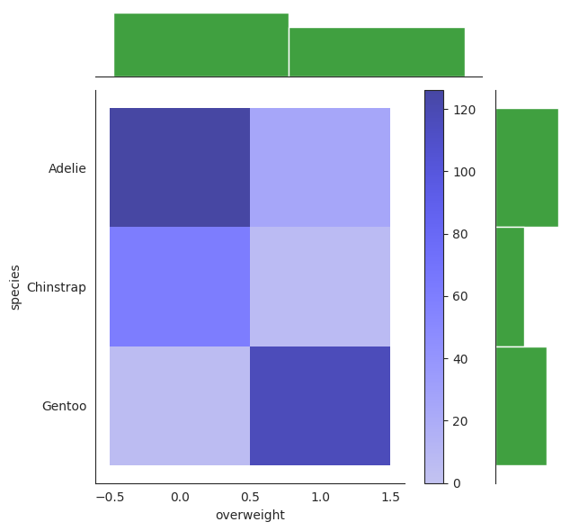
The darker tone of color corresponds to a higher impulse of the joint distribution.
Indeed we can see that the combo of Adelie + overweight = 0 and Gentoo + overweight = 1 presents a darker tone than the rest, indicating that \(\mathbb{P}[X_1=0, Y=A]\) and \(\mathbb{P}[X_1=1, Y=G]\) are the highest impulses of the joint distribution.
In our table they correspond to 0.365 and 0.342 respectively, which is consistent with the plot.
The top and right are the marginal distribution of \(Y\) and \(X_1\) respectively. They are just relative frequencies of both \(Y\) and \(X_1\) respectively.
Note the above all uses histogram as default, where we used normal histograms to “estimate” the PDF of the joint distribution. We can also use a kernel density estimation (KDE) to do so, which is a bit more smooth and accurate. Note everything here is just an estimation. We will use it in continuous distributions later.
To see the empirical conditional distribution of \(X_1=0\) given \(Y=C\) for example, it is simply given by the table above. To calculate we ask ourselves the following question:
What is \(P(X_1=0|Y=C)\)? We simply look at the table constructed earlier and see that it is \(0.8971\). But to read it off this joint distribution table, you first need to recognize that when \(Y=C\), we have shrinked our table to only the rows where \(Y=C\) (2nd row). Then we look at the column where \(X_1=0\) and see that it is 61, then we divide by the sum of the row, which is 68, to get \(0.8971\). Alternatively, it is the same as saying that \(\mathbb{P}[X_1=0, Y=C] / \mathbb{P}[Y=C] = 61 / 68 = 0.8971\).
In this scenario, the author mentioned that we can actually directly compute the posterior probability from the empirical joint distribution table.
For example, if we want to calculate the posterior probability of \(Y=A\) given \(X_1=0\), we simply look at the column \(X_1=0\) and calculate the relative frequency of \(Y=A\),
or equivalently
Note that we are still talking about empirical here, so nothing is really proven yet.
In a similar fashion, we have
This should not be surprising, since if we can construct the joint probability table, then both the marginal and conditional probability tables can be constructed from it. We can confirm this by computing the posterior distribution using the formula above, using Bayes’ rule.
Firstly, our prior says that
These values will handle the \(\mathbb{P}[Y=y]\) term in the formula above. I have to emphasize again that all of these are empirical probabilities, the actual probability of the species of the penguin is not known, i.e \(\mathbb{P}[Y=y]\) is not known but we can reasonably estimate it using statistics, and in this case we estimate it using the relative frequency of each species, we will see later that the relative frequency is an estimator of the actual probability by Maximum Likelihood Estimation.
Next, we find the likelihood terms of \(\mathbb{P}[X_1=0|Y=y]\) for each species \(y\).
Again, these are empirical probabilities, we are not sure if these are the actual probabilities of the features given the species, but we can reasonably estimate it using statistics, and in this case we again use relative frequency to estimate it. We will see later this is modelled by the Multinomial (Categorical) distribution with parameter \(\pi_y\).
The Categorical distribution is a generalization of the Bernoulli and Binomial distributions. When \(k=2\) and \(n=1\), it is the Bernoulli distribution. When \(k=2\) and \(n>1\), it is the Binomial distribution. When \(k>2\) and \(n=1\), it is the Categorical distribution.
Plugging these priors and likelihoods into the formula above, we get the denominator, the normalizing constant, which is
We pause a while to note that \(\mathbb{P}[X_1]\) is the probability of observing \(X_1=x_1\), which is independent of \(Y\). We can compute it using the law of total probability.
Of course, this is also merely the relative frequency of \(X_1=0\) in the dataset, which is expected since \(X_1\) is discrete (binary), but we will never know the actual probability of \(X_1=0\). We can also estimate it using Binomial distribution if we assume that it is a Bernoulli process, but if it is continuous, then it is often harder to estimate it. We will see later that we can omit the denominator since it is “constant” for all \(Y\).
Finally, by Bayes’ rule, we get the posterior probability of \(Y=A\) given \(X_1=0\),
which is the same as the one we calculated earlier using the empirical joint distribution table.
In a similar fashion, we get the posterior probability of \(Y=C\) given \(X_1=0\), and \(Y=G\) given \(X_1=0\).
And the argmax of these three posterior probabilities is \(Y=A\), so we predict that the penguin is of species \(A\). We observe that to get the argmax, we do not need the denominator, because it is the same for all \(Y\).
So we can omit the denominator, and we get the same result, it may no longer sum to 1, but it does not affect the final result.
We also saw here that if our prior is very low, then even though the likelihood is high, the posterior can still be
low if prior << likelihood. This is the reason why we need to use prior knowledge to help us make better predictions.
One Quantitative Predictor#
We now ignore the earlier categorical predictor \(X_1\) and focus on the quantitative predictor \(X_2\),
bill_length_mm. This penguin has a bill_length_mm of 50mm,
so we want to predict the species of the penguin given this information.
We know that as we move on to continuous space, we can no longer use “relative frequency” to estimate the probability of a continuous variable happening, as we will see later.
Let’s do some EDA.
bill_length_mm = penguins[["bill_length_mm", "species", "class_id"]]
display(bill_length_mm)
| bill_length_mm | species | class_id | |
|---|---|---|---|
| 0 | 39.1 | Adelie | 0 |
| 1 | 39.5 | Adelie | 0 |
| 2 | 40.3 | Adelie | 0 |
| 3 | 36.7 | Adelie | 0 |
| 4 | 39.3 | Adelie | 0 |
| ... | ... | ... | ... |
| 337 | 47.2 | Gentoo | 2 |
| 338 | 46.8 | Gentoo | 2 |
| 339 | 50.4 | Gentoo | 2 |
| 340 | 45.2 | Gentoo | 2 |
| 341 | 49.9 | Gentoo | 2 |
342 rows × 3 columns
x2_mean = bill_length_mm["bill_length_mm"].mean()
print(
    f"Mean bill length across the whole population "
    f"without conditioning on class: {x2_mean:.2f} mm"
)
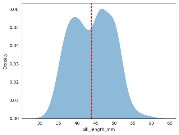
Mean bill length across the whole population without conditioning on class: 43.92 mm
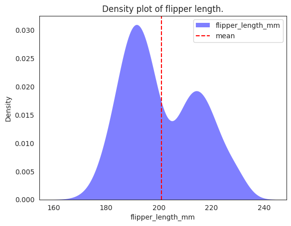
The kdeplot above is for an univariate, empirical estimation of the whole dataset, not conditional on any class label.
# plotting both distibutions on the same figure
_ = sns.kdeplot(data=penguins, x="bill_length_mm", fill=True, common_norm=False, alpha=.5, linewidth=0, legend=True)
# plot vertical line
_ = plt.axvline(x=x2_mean, color='red', linestyle='--')
# plt.legend()
plt.show();
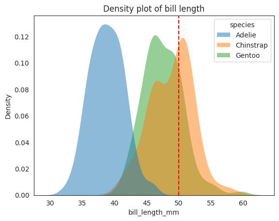
To see the conditional distribution, we can use the hue parameter in seaborn.kdeplot to plot the conditional distribution \(f_{X_2|Y}(x_2|y)\). Recall that this conditional distribution
is a distribution of \(X_2\) in the reduced sample space \(\mathcal{\Omega}_{X_2|Y}\), where \(Y=y\) has happened.
More concretely, you just imagine that given say Adelie has happened, then we zoom into the reduced sample space of the dataset where \(Y\) is Adelie, and plot the distribution of \(X_2\) in this reduced sample space (reduced dataset). Things get a bit more complicated when we have more than one predictor, but the idea is the same, we will see later as well.
I want to emphasize that for 1 predictor conditioned on another random variable, in this case \(X_2\) conditioned on \(Y\), the conditional distribution is like a univariate distribution in \(X_2\). This is because once we \(Y=y\) has happened, there is no randomness left in \(Y\), we are only looking at the distribution of \(X_2\) in the reduced sample space \(\mathcal{\Omega}_{X_2|Y}\).
x2 = 50 # penguin bill length
# plotting both distibutions on the same figure
_ = sns.kdeplot(
    data=penguins,
    x="bill_length_mm",
    hue="species",
    fill=True,
    common_norm=False,
    alpha=0.5,
    linewidth=0,
    legend=True,
)
# plot vertical line
_ = plt.axvline(x2, color="r", linestyle="--", label="50 mm")
plt.title("Density plot of bill length")
# plt.legend()
plt.show();
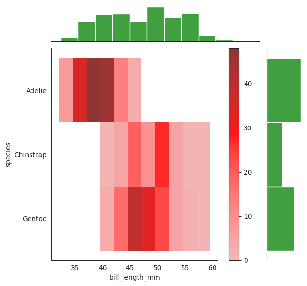
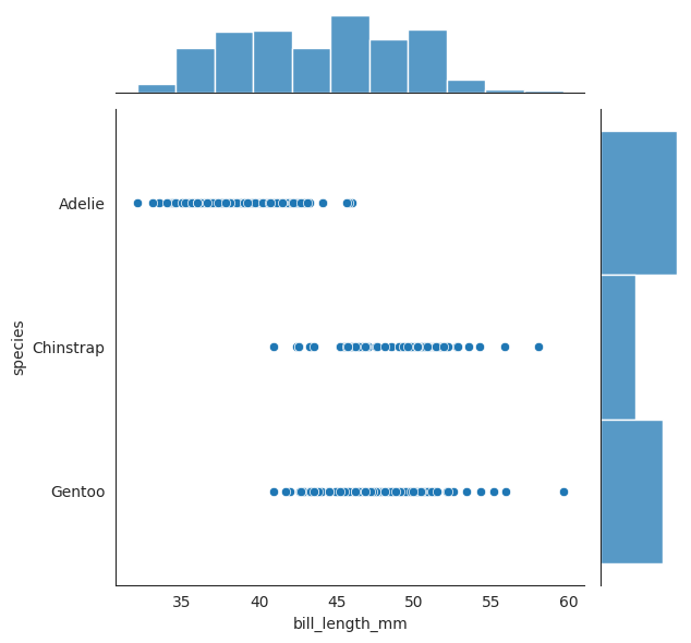
We have seen the conditional distribution plot above, let see the joint distribution of \(X_2\) and \(Y\). Note very carefully that this is a joint distribution of \(X_2\) and \(Y\), not a conditional distribution of \(X_2\) given \(Y\).
g = sns.JointGrid(data=penguins, x="bill_length_mm", y="species")
g.plot_joint(sns.histplot, color = "red", cbar=True)
g.plot_marginals(sns.histplot, color = "green")
sns.jointplot(data=penguins, x="bill_length_mm", y="species")
<seaborn.axisgrid.JointGrid at 0x7f22b469adf0>
We see that the for this penguin with bill_length_mm of 50mm, our gut feeling tells us
that it most likely is not an Adelie, since the distribution of \(X_2\) for Adelie is
much less than 50 mm. It could be a Chinstrap or a Gentoo, but we are not sure which one,
though Chinstrap is tends to be longer for bill length, but the earlier section has
told us that we should weigh the prior probability of each species into consideration.
We can again use Bayes’ rule to compute the posterior probability of \(Y=A\) given \(X_2=50\), this time we use the notation \(f\) to represent our earlier \(\mathbb{P}\).
For example, since our given feature is bill_length_mm of 50mm, we see
Again, we use argmax to solve the problem,
Now we met our first hurdle here since \(f_{X_2|Y}(50|y)\) is not easy to compute since
\(X_2\) is a continuous variable, we cannot construct a empirical joint distribution table like
how we did earlier (species vs bill_length_mm does not work here).
Further, we haven’t assumed a model for \(X_2\) yet from which to define the likelihood \(\mathbb{P}[X_2=50|Y=y]\) or \(\mathcal{L}(X_2=50|Y=y)\). We can do like previously to assume naively (pun intended) that the distribution of \(X_2\) given Y is Gaussian, note carefully that this is a conditional distribution of \(X_2\) given \(Y\), we can also say in same term that \(X_2\) is continuous and conditionally normal.
Notice here that it is possible that the three conditional distributions are different with different \(\mu\) and \(\sigma\). Technically, we can even assume that the three conditional distributions come from different families, but we will stick to the Gaussian family for now. We usually call this the Gaussian Naive Bayes model.
From the conditional plot above, we can see that the three species are not well separated in the joint distribution space, so we cannot expect a good performance from the Gaussian Naive Bayes model. For example, 50 mm could very well be either Gentoo or Chinstrap from the plot since they are not well separated.
In our example, the conditional distribution of \(X_2\) given \(Y\) appears quite Gaussian. Even if not so, the Central Limit Theorem tells us that the sum of many independent random variables tends to be Gaussian, so we can still use the Gaussian Naive Bayes model if we have enough data (?).
The next question is how do we estimate the \(\mu\) and \(\sigma\) for each \(X_2\) given \(Y\)? We can use the Maximum Likelihood Estimation (MLE) method to estimate the parameters.
It turns out that the MLE of \(\mu\) and \(\sigma\) for each \(X_2\) given \(Y\) is the sample mean and sample standard deviation of \(X_2\) given \(Y\). They are unbiased estimators of the true \(\mu\) and \(\sigma\)!
The below table summarizes the sample (empirical) mean and sample standard deviation of \(X_2\) given \(Y\). For example, the sample mean of \(X_2\) given \(Y=A\) is 38.8 mm, and the sample standard deviation is 2.66 mm.
Species |
Sample Mean |
Sample Standard Deviation |
|---|---|---|
A |
38.8 |
2.66 |
C |
48.8 |
3.34 |
G |
47.5 |
3.08 |
Remember again, the sample mean and sample standard deviation are unbiased estimators of the true \(\mu\) and \(\sigma\), and can be shown by MLE.
bill_length_mean_std = bill_length_mm.groupby('species').agg({'bill_length_mm': ['mean', 'std']})
bill_length_mean_std
| bill_length_mm | ||
|---|---|---|
| mean | std | |
| species | ||
| Adelie | 38.791391 | 2.663405 |
| Chinstrap | 48.833824 | 3.339256 |
| Gentoo | 47.504878 | 3.081857 |
Let’s plot the normal distribution with the sample mean and sample standard deviation for each \(X_2\) given \(Y\). We also round off the sample mean and sample standard deviation to 2 decimal places for convenience and stay true to the original book.
# rv_adelie = stats.norm(bill_length_mean_std.loc['Adelie']['bill_length_mm']['mean'], bill_length_mean_std.loc['Adelie']['bill_length_mm']['std'])
# rv_chinstrap = stats.norm(bill_length_mean_std.loc['Chinstrap']['bill_length_mm']['mean'], bill_length_mean_std.loc['Chinstrap']['bill_length_mm']['std'])
# rv_gentoo = stats.norm(bill_length_mean_std.loc['Gentoo']['bill_length_mm']['mean'], bill_length_mean_std.loc['Gentoo']['bill_length_mm']['std'])

rv_adelie = stats.norm(38.8, 2.66)
rv_chinstrap = stats.norm(48.8, 3.34)
rv_gentoo = stats.norm(47.5, 3.08)
fig, ax = plt.subplots(1, 1)
ax.plot(np.linspace(30, 60, 100), rv_adelie.pdf(np.linspace(30, 60, 100)), 'r-', lw=5, alpha=0.6, label='Adelie')
ax.plot(np.linspace(30, 60, 100), rv_chinstrap.pdf(np.linspace(30, 60, 100)), 'b-', lw=5, alpha=0.6, label='Chinstrap')
ax.plot(np.linspace(30, 60, 100), rv_gentoo.pdf(np.linspace(30, 60, 100)), 'g-', lw=5, alpha=0.6, label='Gentoo')
# plot vertical line
_ = plt.axvline(x2, color="y", linestyle="--", label="50 mm")
_ = plt.axvline(x2+0.5, color="y", linestyle="--", label="50.5 mm")
_ = plt.axvline(x2-0.5, color="y", linestyle="--", label="49.5 mm")
ax.set_xlabel('bill_length_mm')
ax.set_ylabel('Probability density')
ax.legend()
plt.show();
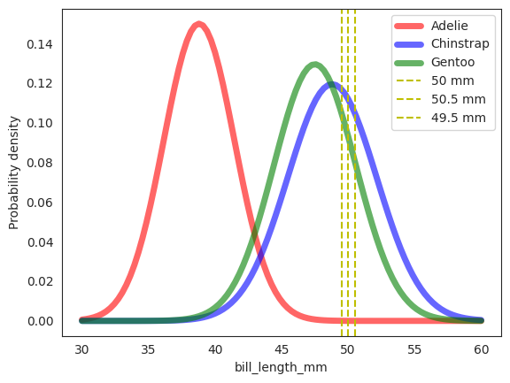
As we can see, the this naive assumption of Gaussian distribution for \(X_2\) given \(Y\) is not perfect, but it isn’t too bad either. Note the distinction in the plot here and previously. The previous diagram is the empirical density plot of the raw data, while this one is the density plot of the conditional gaussian distribution of \(X_2\) given \(Y\) where we have used the sample mean and sample standard deviation as the parameters of the Gaussian \(X_2 \mid Y \sim \mathcal{N}(\mu, \sigma^2)\).
Now we can finally solve our “hurdle” problem of computing \(f_{X_2|Y}(50|y)\) for each \(y \in \{A, C, G\}\).
We can use the Gaussian density function to compute the probability density of \(X_2=50\) given \(Y=y\). Geometrically, we can see that the probability density of \(X_2=50\) given \(Y=y\) is the area under the curve of the Gaussian density function at \(X_2=50\) for each \(Y=y\) around a small neighborhood \(\delta\) of \(X_2=50\). Illustrated in diagram above, the \(\delta=0.5\) mm and the area under the curve is computed by the integral of the Gaussian density function from \(X_2=49.5\) to \(X_2=50.5\). In reality however, the \(\delta\) is infinitesimally small.
In practice, we just need to compute the probability density of \(X_2=50\) given \(Y=y\) at \(X_2=50\) and not the actual probability. Note very carefully that PDF is not probability, it is the probability density!!!
As mentioned earlier, we should compute the posterior conditional PDF and maximize over it instead of the posterior conditional probability since probability at a point is 0 for continuous variables.
And so,
Similarly,
Note that \(\mu_A\) and \(\sigma_A\) are the sample mean and sample standard deviation of \(X_2\) given \(Y=A\). Notation wise it is fine but you can also view it as \(\mu_{A|X_2}\) and \(\sigma_{A|X_2}\).
px2_given_adelie = rv_adelie.pdf(x2)
px2_given_chinstrap = rv_chinstrap.pdf(x2)
px2_given_gentoo = rv_gentoo.pdf(x2)

print(f'P(X_2=50|Adelie) = {px2_given_adelie:.7f}')
print(f'P(X_2=50|Chinstrap) = {px2_given_chinstrap:.3f}')
print(f'P(X_2=50|Gentoo) = {px2_given_gentoo:.5f}')
P(X_2=50|Adelie) = 0.0000212
P(X_2=50|Chinstrap) = 0.112
P(X_2=50|Gentoo) = 0.09317
As an example, the probability density of \(X_2=50\) given \(Y=A\) is \(0.0000212 \text{ mm}^{-1}\), and indeed from the plot above, the area under the curve is definitely the smallest, and the lowest since there is almost no Adelie with 50 mm bill length.
So the marginal PDF of observing a penguin with a 50 mm bill length is,
Once again, this number is not a probability, it is the probability density, it just means for every 1 mm, there is a 0.05579 mm chance of observing a penguin with a 50 mm bill length around a small neighborhood \(\delta\) mm of 50 mm. In laymen, it is how “dense” the probability is at that point.
Then, the posterior conditional PDF of \(Y\) given \(X_2=50\) is,
Again note that these are not probabilities, they are probability densities. But since they have the same denominator, it is normalized and so sum up to 1 in this case. This time round, the final results was pushed over again by the fact that Gentoo is more common in the wild (prior \(P(Y=G)\approx 0.3605\)).
Two (Continuous) Predictors#
The reality is that the data is usually multi-dimensional, and we need to use multiple predictors to make a prediction.
In the previous two examples, we have seen that for the same penguin with the following features,
body_mass_g: \(< 4200 \mathrm{~g}\) (overweight= 0 ifbody_mass_g\(< 4200 \mathrm{~g}\), 1 otherwise)bill_length_mm: \(50 \mathrm{~mm}\)flipper_length_mm: \(195 \mathrm{~mm}\)
the predictions for the species is an Adelie if we only use overweight, and
a Gentoo if we only use bill_length_mm. This inconsistency suggest that
our model may have room for improvement. Intuitively, we can add
multiple predictors to our model to make a more accurate prediction, though
this is not always the case if the predictors are correlated, or if there are
too many predictors (curse of dimensionality).
flipper_length_mm = penguins[["flipper_length_mm", "species", "class_id"]]
display(flipper_length_mm)
| flipper_length_mm | species | class_id | |
|---|---|---|---|
| 0 | 181.0 | Adelie | 0 |
| 1 | 186.0 | Adelie | 0 |
| 2 | 195.0 | Adelie | 0 |
| 3 | 193.0 | Adelie | 0 |
| 4 | 190.0 | Adelie | 0 |
| ... | ... | ... | ... |
| 337 | 214.0 | Gentoo | 2 |
| 338 | 215.0 | Gentoo | 2 |
| 339 | 222.0 | Gentoo | 2 |
| 340 | 212.0 | Gentoo | 2 |
| 341 | 213.0 | Gentoo | 2 |
342 rows × 3 columns
x3_mean = flipper_length_mm["flipper_length_mm"].mean()
print(
    f"Mean flipper length across the whole population "
    f"without conditioning on class: {x3_mean:.2f} mm"
)
Mean flipper length across the whole population without conditioning on class: 200.92 mm
# plotting both distibutions on the same figure
_ = sns.kdeplot(
    data=penguins,
    x="flipper_length_mm",
    fill=True,
    common_norm=False,
    alpha=0.5,
    linewidth=0,
    legend=True,
    label="flipper_length_mm",
    color="blue",
)
# plot vertical line
_ = plt.axvline(x=x3_mean, color="red", linestyle="--", label="mean")
plt.legend()
plt.title("Density plot of flipper length.")
plt.show()
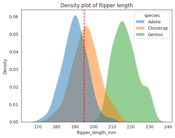
x3 = 195 # penguin flipper length
# plotting both distibutions on the same figure
_ = sns.kdeplot(
    data=penguins,
    x="flipper_length_mm",
    hue="species",
    fill=True,
    common_norm=False,
    alpha=0.5,
    linewidth=0,
    legend=True,
)
# plot vertical line
_ = plt.axvline(x3, color="r", linestyle="--", label="195 mm")
plt.title("Density plot of flipper length")
# plt.legend()
plt.show();
# plotting both distibutions on the same figure
x2 = 50
_ = sns.kdeplot(
    data=penguins,
    x="bill_length_mm",
    hue="species",
    fill=True,
    common_norm=False,
    alpha=0.5,
    linewidth=0,
    legend=True,
)
# plot vertical line
_ = plt.axvline(x2, color="r", linestyle="--", label="50 mm")
plt.title("Density plot of bill length")
# plt.legend()
plt.show();
The bill_length_mm and flipper_length_mm are plotted above as density plots,
just by looking at them alone may be hard to distinguish between the
Chinstrap and Gentoo for the bill_length_mm plot because they are
quite close (overlap in density curve) with each other, while if you
only look at the flipper_length_mm plot, you can see that the Chinstrap and
Adelie are now quite close to each other, but if you combine
both bill_length_mm and flipper_length_mm together, you can see that
it is much easier to distinguish between them.
This plot is from Seaborn guide, one can see with default setting
we have a joint plot of bill_length_mm and flipper_length_mm with the marginal
histograms on the side. The joint plot is a scatter plot of the two variables.
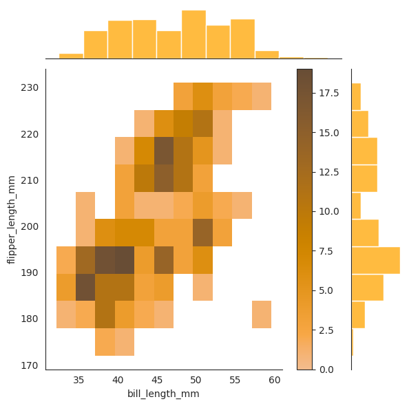
The plot with kind=hist will show the joint distribution as a histogram, and the
rectangular bins are colored by the density of the points in each bin. The darker
the color the more points in that bin. You can understand this as impulses from chan’s book.
Lastly, the plot with kind=kde will show the joint distribution as a contour plot.
sns.jointplot(data=penguins, x="bill_length_mm", y="flipper_length_mm", color="orange")
sns.jointplot(
    data=penguins,
    x="bill_length_mm",
    y="flipper_length_mm",
    kind="hist",
    color="orange",
    cbar=True,
)
sns.jointplot(
    data=penguins,
    x="bill_length_mm",
    y="flipper_length_mm",
    kind="kde",
    color="orange",
    # cbar=True,
)
<seaborn.axisgrid.JointGrid at 0x7f21f3a63070>
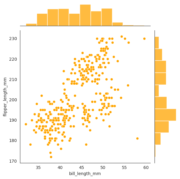
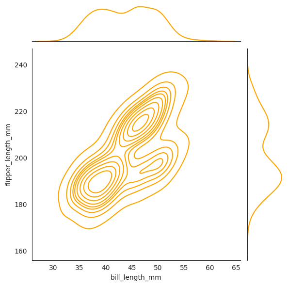
The contour plot is a 2d slice of the 3d density plot where \(z = f_{X_1, X_2}(x_1, x_2)\) is constant.
To see the joint distribution conditioned on the class (species) \(Y\), where \(Y\)
can be treated as a random variable as well 1, we can use the hue argument.
To emphasise, the way to approach conditional distributions is to zoom in on the “reduced” sample space, for example if I want to look at the conditional distribution of \(X_2\) and \(X_3\) conditioned on \(Y=G\), then you should look at the green colored hues.
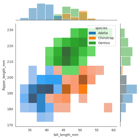
sns.jointplot(data=penguins, x="bill_length_mm", y="flipper_length_mm", hue="species")
sns.jointplot(
    data=penguins, x="bill_length_mm", y="flipper_length_mm", hue="species", kind="hist"
)
sns.jointplot(
    data=penguins, x="bill_length_mm", y="flipper_length_mm", hue="species", kind="kde"
)
<seaborn.axisgrid.JointGrid at 0x7f21f0455d60>
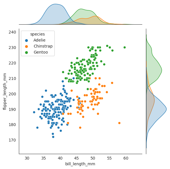
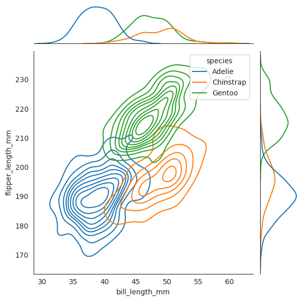
Now we plot two dashed lines for where \(X_2=50\) and \(X_3=195\) respectively, and see that when combined together, the penguin lies amongst the Chinstrap species, and it is not even close to the other two speces!!
To internalize this concept, we are again looking at the argmax expression below:
or equivalently,
We want to know given each species \(Y\), which \(y\) maximizes this conditional probability density function \(f_{Y|X_2,X_3}(y|x_2,x_3)\). In other words, given \(X_2=50\) and \(X_3=195\), which species \(Y\) has the highest “probability” of being the true species of the penguin. And from the diagram, we can see that the Chinstrap species has the highest probability of being the true species of the penguin since geometrically it lies closest to where Chinstrap will is. We will see later that the geometric interpretation of this is correct, with the formula.
sns.jointplot(data=penguins, x="bill_length_mm", y="flipper_length_mm", hue="species")
_ = plt.axvline(x2, color="black", linestyle="--", label="50 mm")
_ = plt.axhline(x3, color="black", linestyle="--", label="195 mm")

sns.jointplot(
    data=penguins, x="bill_length_mm", y="flipper_length_mm", hue="species", kind="hist"
)
_ = plt.axvline(x2, color="black", linestyle="--", label="50 mm")
_ = plt.axhline(x3, color="black", linestyle="--", label="195 mm")

sns.jointplot(
    data=penguins, x="bill_length_mm", y="flipper_length_mm", hue="species", kind="kde"
)
_ = plt.axvline(x2, color="black", linestyle="--", label="50 mm")
_ = plt.axhline(x3, color="black", linestyle="--", label="195 mm")


Conditional Independence#
Let’s use naive Bayes to make a prediction for the same penguin with the following features \(X_2=x_2\) and \(X_3=x_3\).
Another hurdle is presented in front of us, we need to compute the conditional joint distribution (PDF) \(f_{X_2,X_3|Y}(x_2,x_3|y)\), which is not easy to compute.
This is because we were dealing with only one-dimensional distribution, even though there are two variables just now, but as I mentioned, when we condition on \(Y\), we are looking at the reduced sample space of \(X\) in which \(Y\) is fixed, and not the joint sample space of \(X\) and \(Y\). This is the reason why we can happily use 1-dimensional Gaussian to get the conditional distribution of \(X_2\).
To reconcile this, Naive Bayes assumes that the predictors are conditionally independent1. It states that given \(D\) continuous predictors \(X_1, \ldots, X_D\), they are called conditionally independent given \(Y\) if the joint distribution of \(X_1, \ldots, X_D\) given \(Y\) can be written as
The theorem holds for discrete case as well with the difference being that the PDF is replaced by the PMF.
This theorem means that within each class (species), the predictors are independent.
More concretely, if we say that \(X_2\) and \(X_3\) are conditionally independent given \(Y\),
then we are saying that within each class (species), the bill_length_mm (\(X_2\))
is independent of the flipper_length_mm (\(X_3\)). This is a very strong assumption,
but is at the heart of Naive Bayes and many other algorithms. It simplifies the parameters a lot
(see d2l on the parameters reduction). Such a strong assumption is usually not always true,
see the plot below again, within the class Gentoo, we can see that the bill_length_mm
and flipper_length_mm exhibit some positive correlation. We will still use this assumption
even though it is not perfect.
display(penguins.corr()) # correlation matrix but not conditioned on class
/tmp/ipykernel_2843/2213928773.py:1: FutureWarning: The default value of numeric_only in DataFrame.corr is deprecated. In a future version, it will default to False. Select only valid columns or specify the value of numeric_only to silence this warning.
  display(penguins.corr()) # correlation matrix but not conditioned on class
| bill_length_mm | bill_depth_mm | flipper_length_mm | body_mass_g | overweight | class_id | |
|---|---|---|---|---|---|---|
| bill_length_mm | 1.000000 | -0.235053 | 0.656181 | 0.595110 | 0.448506 | 0.731369 |
| bill_depth_mm | -0.235053 | 1.000000 | -0.583851 | -0.471916 | -0.533576 | -0.744076 |
| flipper_length_mm | 0.656181 | -0.583851 | 1.000000 | 0.871202 | 0.762945 | 0.854307 |
| body_mass_g | 0.595110 | -0.471916 | 0.871202 | 1.000000 | 0.851748 | 0.750491 |
| overweight | 0.448506 | -0.533576 | 0.762945 | 0.851748 | 1.000000 | 0.689371 |
| class_id | 0.731369 | -0.744076 | 0.854307 | 0.750491 | 0.689371 | 1.000000 |
Adelie = penguins[penguins["species"] == "Adelie"]
Chinstrap = penguins[penguins["species"] == "Chinstrap"]
Gentoo = penguins[penguins["species"] == "Gentoo"]

display(Adelie.corr())
display(Chinstrap.corr())
display(Gentoo.corr())
/tmp/ipykernel_2843/509882408.py:5: FutureWarning: The default value of numeric_only in DataFrame.corr is deprecated. In a future version, it will default to False. Select only valid columns or specify the value of numeric_only to silence this warning.
  display(Adelie.corr())
| bill_length_mm | bill_depth_mm | flipper_length_mm | body_mass_g | overweight | class_id | |
|---|---|---|---|---|---|---|
| bill_length_mm | 1.000000 | 0.391492 | 0.325785 | 0.548866 | 0.338386 | NaN |
| bill_depth_mm | 0.391492 | 1.000000 | 0.307620 | 0.576138 | 0.319450 | NaN |
| flipper_length_mm | 0.325785 | 0.307620 | 1.000000 | 0.468202 | 0.336676 | NaN |
| body_mass_g | 0.548866 | 0.576138 | 0.468202 | 1.000000 | 0.715684 | NaN |
| overweight | 0.338386 | 0.319450 | 0.336676 | 0.715684 | 1.000000 | NaN |
| class_id | NaN | NaN | NaN | NaN | NaN | NaN |
/tmp/ipykernel_2843/509882408.py:6: FutureWarning: The default value of numeric_only in DataFrame.corr is deprecated. In a future version, it will default to False. Select only valid columns or specify the value of numeric_only to silence this warning.
  display(Chinstrap.corr())
| bill_length_mm | bill_depth_mm | flipper_length_mm | body_mass_g | overweight | class_id | |
|---|---|---|---|---|---|---|
| bill_length_mm | 1.000000 | 0.653536 | 0.471607 | 0.513638 | 0.287084 | NaN |
| bill_depth_mm | 0.653536 | 1.000000 | 0.580143 | 0.604498 | 0.375972 | NaN |
| flipper_length_mm | 0.471607 | 0.580143 | 1.000000 | 0.641559 | 0.398093 | NaN |
| body_mass_g | 0.513638 | 0.604498 | 0.641559 | 1.000000 | 0.655613 | NaN |
| overweight | 0.287084 | 0.375972 | 0.398093 | 0.655613 | 1.000000 | NaN |
| class_id | NaN | NaN | NaN | NaN | NaN | NaN |
/tmp/ipykernel_2843/509882408.py:7: FutureWarning: The default value of numeric_only in DataFrame.corr is deprecated. In a future version, it will default to False. Select only valid columns or specify the value of numeric_only to silence this warning.
  display(Gentoo.corr())
| bill_length_mm | bill_depth_mm | flipper_length_mm | body_mass_g | overweight | class_id | |
|---|---|---|---|---|---|---|
| bill_length_mm | 1.000000 | 0.643384 | 0.661162 | 0.669166 | 0.236458 | NaN |
| bill_depth_mm | 0.643384 | 1.000000 | 0.706563 | 0.719085 | 0.235313 | NaN |
| flipper_length_mm | 0.661162 | 0.706563 | 1.000000 | 0.702667 | 0.240309 | NaN |
| body_mass_g | 0.669166 | 0.719085 | 0.702667 | 1.000000 | 0.425197 | NaN |
| overweight | 0.236458 | 0.235313 | 0.240309 | 0.425197 | 1.000000 | NaN |
| class_id | NaN | NaN | NaN | NaN | NaN | NaN |
It is obvious that the assumption of conditional independence is not true from the empirical data above. However, we will still use this assumption even though it is not perfect, and in the event if our Naive Bayes does not perform well, we know where went wrong…
Back to our
We now have an answer on how to unpack the joint conditional distribution \(f_{X_2,X_3|Y}(x_2,x_3|y)\).
We can merely do
so that our previous expression becomes
We have already gotten the conditional distribution of \(X_2\) given \(Y\) earlier, \(f_{X_2|Y}(x_2|y)\) is already found. We can use the same method to find the conditional distribution of \(X_3\) given \(Y\).
flipper_length_mean_std = flipper_length_mm.groupby("species").agg({"flipper_length_mm": ["mean", "std"]})
flipper_length_mean_std
| flipper_length_mm | ||
|---|---|---|
| mean | std | |
| species | ||
| Adelie | 189.953642 | 6.539457 |
| Chinstrap | 195.823529 | 7.131894 |
| Gentoo | 217.186992 | 6.484976 |
x2_x3_mean_std = penguins.groupby("species").agg(
    {"bill_length_mm": ["mean", "std"], "flipper_length_mm": ["mean", "std"]}
)
display(x2_x3_mean_std)
| bill_length_mm | flipper_length_mm | |||
|---|---|---|---|---|
| mean | std | mean | std | |
| species | ||||
| Adelie | 38.791391 | 2.663405 | 189.953642 | 6.539457 |
| Chinstrap | 48.833824 | 3.339256 | 195.823529 | 7.131894 |
| Gentoo | 47.504878 | 3.081857 | 217.186992 | 6.484976 |
rv_adelie = stats.norm(190., 6.54)
rv_chinstrap = stats.norm(196., 7.13)
rv_gentoo = stats.norm(217., 6.48)

fig, ax = plt.subplots(1, 1)
ax.plot(np.linspace(170, 240, 100), rv_adelie.pdf(np.linspace(170, 240, 100)), 'r-', lw=5, alpha=0.6, label='Adelie')
ax.plot(np.linspace(170, 240, 100), rv_chinstrap.pdf(np.linspace(170, 240, 100)), 'b-', lw=5, alpha=0.6, label='Chinstrap')
ax.plot(np.linspace(170, 240, 100), rv_gentoo.pdf(np.linspace(170, 240, 100)), 'g-', lw=5, alpha=0.6, label='Gentoo')
# plot vertical line
_ = plt.axvline(x3, color="y", linestyle="--", label="195 mm")
_ = plt.axvline(x3+0.5, color="y", linestyle="--", label="195.5 mm")
_ = plt.axvline(x3-0.5, color="y", linestyle="--", label="194.5 mm")
ax.set_xlabel('flipper_length_mm')
ax.set_ylabel('Probability density')
ax.legend()
plt.show();
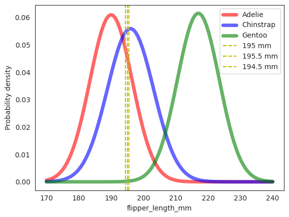
px3_given_adelie = rv_adelie.pdf(x3)
px3_given_chinstrap = rv_chinstrap.pdf(x3)
px3_given_gentoo = rv_gentoo.pdf(x3)

print(f'P(X_3=195|Adelie) = {px3_given_adelie:.5f}')
print(f'P(X_3=195|Chinstrap) = {px3_given_chinstrap:.5f}')
print(f'P(X_3=195|Gentoo) = {px3_given_gentoo:.7f}')
P(X_3=195|Adelie) = 0.04554
P(X_3=195|Chinstrap) = 0.05541
P(X_3=195|Gentoo) = 0.0001934
For formality, the code above translates to
Similarly, we can compute the other two conditional distributions to be \(0.05541\) and \(0.0001934\) respectively.
Next, we compute the denominator, which is the joint distribution of observing \(X_2=50\) and \(X_3=195\).
We plug into Bayes’ rule to get the posterior probability of \(Y=A\) given \(X_2=50\) and \(X_3=195\).
Similarly, we can compute the posterior probability of \(Y=C\) and \(Y=G\) given \(X_2=50\) and \(X_3=195\).
We then take the argmax of the posterior probabilities to get the prediction. In this case, it is \(Y=C\) with a posterior probability of \(0.9944\).
Three Predictors#
Even though not mentioned in the book, we can also use 3 predictors to make a prediction.
The three predictors are overweight, bill_length_mm, and flipper_length_mm. The tricky
part is that overweight is a categorical variable, and bill_length_mm and flipper_length_mm
are continuous variables. We can still do it though, dafriedman97
mentioned that we for a random vector \(\mathbf{X} = (X_{1}, X_{2}, \ldots, X_{D})\), the individual
predictors can take on different distributions. In our case, overweight is assumed to be follow a Bernoulli distribution,
bill_length_mm and flipper_length_mm are assumed to be follow a Gaussian distribution. Note again that
this is an assumption, and we can always change it to something else if we want to since Naive Bayes does
not have any assumptions on the distribution of the predictors (potentially confusing part!).
Summary#
Here we summarize a few key points.
If prior is low but likelihood is high, then posterior may not be high if prior << likelihood.
The normalizing constant is constant during argmax comparison, and hence is often omitted. You can always recover the normalizing constant since you have the posterior and the numerator.
The key here is estimation theory, for example, to estimate the priors, all we need to do is to find the proportion of each class in the training set. This proportion is an unbiased estimator of the true prior probability.
Conditional Independence is key for Naive Bayes to work, but if your model does not do well, then this assumption may be violated. Note that the conditional independence assumption along with the \(\iid\) assumpiton are the only assumptions for Naive Bayes. Assuming the conditional distribution is Gaussian is not an assumption, it is just a way to make the model tractable. You can come up with your own assumptions for the conditional distribution.
PyTorch#
Subset data to only include bill_length_mm and flipper_length_mm.
Further split the data into training and test sets.
X = penguins[["bill_length_mm", "flipper_length_mm"]].values
y = penguins["class_id"].values
X_train, X_test, y_train, y_test = model_selection.train_test_split(X, y, test_size=0.1, random_state=42)
def estimate_prior_parameters(y: torch.Tensor) -> torch.Tensor:
    """Calculate the prior distribution of the classes based on the
    relative frequencies of the classes in the dataset."""
    probs = torch.unique(y, return_counts=True)[1] / len(y)
    distribution = torch.distributions.Categorical(probs=probs)
    return distribution
The prior distribution of the whole (not split) is indeed the same as the prior distribution we got in the previous section The Prior.
prior = estimate_prior_parameters(torch.from_numpy(y))
print(f"Prior distribution: {prior.probs}")
Prior distribution: tensor([0.4415, 0.1988, 0.3596])
def estimate_likelihood_parameters(X: torch.Tensor, y: torch.Tensor) -> torch.Tensor:
    """Estimate the parameters of X conditional on y where X | y is
    assumed to be univariate gaussian for each X_d in X."""
    n_classes = len(torch.unique(y))
    n_features = X.shape[1]

    # mean vector = loc -> (n_classes, n_features)
    loc = torch.zeros(n_classes, n_features)
    # covariance matrix -> (n_classes, n_features)
    # diagonal matrix since features are independent
    covariance_matrix = torch.zeros(n_classes, n_features, n_features)

    for k in range(n_classes):
        X_where_k = X[torch.where(y == k)]
        for d in range(n_features):
            mean = X_where_k[:, d].mean()
            var = X_where_k[:, d].var()
            loc[k, d] = mean
            covariance_matrix[k, d, d] = var

    distribution = torch.distributions.MultivariateNormal(
        loc=loc, covariance_matrix=covariance_matrix
    )
    return distribution
Sanity check that mean and variance are correct when compared to the results from pandas dataframe.
x2_x3_mean_std_var = penguins.groupby("species").agg({"bill_length_mm": ["mean", "std", "var"], "flipper_length_mm": ["mean", "std", "var"]})
display(x2_x3_mean_std_var)
| bill_length_mm | flipper_length_mm | |||||
|---|---|---|---|---|---|---|
| mean | std | var | mean | std | var | |
| species | ||||||
| Adelie | 38.791391 | 2.663405 | 7.093725 | 189.953642 | 6.539457 | 42.764503 |
| Chinstrap | 48.833824 | 3.339256 | 11.150630 | 195.823529 | 7.131894 | 50.863916 |
| Gentoo | 47.504878 | 3.081857 | 9.497845 | 217.186992 | 6.484976 | 42.054911 |
class_conditionals = estimate_likelihood_parameters(torch.from_numpy(X), torch.from_numpy(y))
print(f"Mean vector:\n{class_conditionals.mean}")
print(f"Covariance matrix:\n{class_conditionals.covariance_matrix}")
Mean vector:
tensor([[ 38.7914, 189.9536],
        [ 48.8338, 195.8235],
        [ 47.5049, 217.1870]])
Covariance matrix:
tensor([[[ 7.0937,  0.0000],
         [ 0.0000, 42.7645]],

        [[11.1506,  0.0000],
         [ 0.0000, 50.8639]],

        [[ 9.4978,  0.0000],
         [ 0.0000, 42.0549]]])
The mean is a \(3 \times 2\) matrix, and the (co)variance is a \(3 \times 2 \times 2\) matrix and
can be mapped to the x2_x3_mean_std_var table.
For the mean matrix, the first row is the mean (\(\boldsymbol{\mu}_{X_1|Y=A}\)) of bill_length_mm and flipper_length_mm for Adelie,
the second row is the mean (\(\boldsymbol{\mu}_{X_1|Y=C}\)) of bill_length_mm and flipper_length_mm for Chinstrap, and the third row
is the mean (\(\boldsymbol{\mu}_{X_1|Y=G}\)) of bill_length_mm and flipper_length_mm for Gentoo.
For instance, the first row is \([38.7914, 189.9536]\) is indeed the mean of bill_length_mm and flipper_length_mm for Adelie.
For the covariance matrix, the first row is a \(2 \times 2\) matrix, which corresponds to \(\boldsymbol{\Sigma}_{X_1|Y=A}\), the second row is \(\boldsymbol{\Sigma}_{X_1|Y=C}\), and the third row is \(\boldsymbol{\Sigma}_{X_1|Y=G}\).
For instance, the first row being \([[7.0937, 0], [0, 42.7645]]\) is indeed the covariance matrix of bill_length_mm and flipper_length_mm for Adelie where \(7.0937\) is the variance of bill_length_mm and \(42.7645\) is the variance of flipper_length_mm.
Now, this may seem confusing at first, as we have established that each conditional distribution \(X_d|Y\) is a Gaussian distribution, and since all \(D\) of them are independent, we estimate the mean and variance of each univariate Gaussian distribution. However, the way we have done it just now suggests that we are estimating the mean and variance of a multivariate Gaussian distribution. What’s the catch here?
The catch is in Random Vectors, finding the mean vector and covariance matrix of \(D\) independent
random variables \(X_1, X_2, \ldots, X_D\) is equivalent to finding the mean and
variance of each univariate Gaussian distribution. So by construction,
the diagonals of each covariance matrix in class_conditionals.covariance_matrix are the
variance of each univariate Gaussian distribution, and the off-diagonals are 0.
This is a compact way to represent the mean and covariance matrix of a multivariate Gaussian distribution where each of its components are independent.
In my code, theta is a \(K \times D = 3 \times 2\) matrix, where \(K\) is the number of classes and \(D\) is the number of predictors. But inside each
entry of theta, it is a \(1 \times 2\) row vector (a tuple of two numbers). So in the end
it is also a \(3 \times 2 \times 2\) matrix, but means very different things from the above pytorch example.
In our theta, the first row is a \(2 \times 2\) matrix encoding \(\mu_{X_1|Y=A}\), \(\mu_{X_2|Y=A}\), \(\sigma_{X_1|Y=A}\), and \(\sigma_{X_2|Y=A}\), the second row is a \(2 \times 2\) encoding \(\mu_{X_1|Y=C}\), \(\mu_{X_2|Y=C}\), \(\sigma_{X_1|Y=C}\), and \(\sigma_{X_2|Y=C}\), and the third row is a \(2 \times 2\) encoding \(\mu_{X_1|Y=G}\), \(\mu_{X_2|Y=G}\), \(\sigma_{X_1|Y=G}\), and \(\sigma_{X_2|Y=G}\).
Below is some functions to plot the contours.
def get_meshgrid(x0_range, x1_range, num_points=100):
    x0 = np.linspace(x0_range[0], x0_range[1], num_points)
    x1 = np.linspace(x1_range[0], x1_range[1], num_points)
    return np.meshgrid(x0, x1)

def contour_plot(x0_range, x1_range, prob_fn, batch_shape, colours, levels=None, num_points=100):
    X0, X1 = get_meshgrid(x0_range, x1_range, num_points=num_points)
    X_input_space = np.expand_dims(np.array([X0.ravel(), X1.ravel()]).T, 1)
    X_input_space = torch.from_numpy(X_input_space)

    Z = prob_fn(X_input_space)
    Z = torch.exp(Z) # convert log pdf to pdf
    Z = Z.numpy()
    # Z = prob_fn(np.expand_dims(np.array([X0.ravel(), X1.ravel()]).T, 1))
    Z = np.array(Z).T.reshape(batch_shape, *X0.shape)

    for batch in np.arange(batch_shape):
        if levels:
            plt.contourf(X0, X1, Z[batch], alpha=0.2, colors=colours, levels=levels)
        else:
            plt.contour(X0, X1, Z[batch], colors=colours[batch], alpha=0.3)
def plot_data(x, y, labels, colours):
    for c in np.unique(y):
        inx = np.where(y == c)
        plt.scatter(x[inx, 0], x[inx, 1], label=labels[c], c=colours[c])
    plt.title("Training set")
    plt.xlabel("bill_length_mm")
    plt.ylabel("flipper_length_mm")
    plt.legend()
class_names = ["Adelie", "Chinstrap", "Gentoo"]
class_colours = ['blue', 'orange', 'green']
We assume the features are conditionally independent given the class label, and follows a Gaussian.
Note we need to use torch.exp to exponentiate the log-likelihood back to normal scale, as the log-likelihood is in log-space.
class_conditionals.log_prob(torch.tensor([50, 195])), torch.exp(class_conditionals.log_prob(torch.tensor([50, 195])))
(tensor([-13.8483,  -5.0759, -11.0133]),
 tensor([9.6774e-07, 6.2458e-03, 1.6482e-05]))
plt.figure(figsize=(10, 6))
plot_data(X, y, class_names, class_colours)
x0_min, x0_max = X[:, 0].min(), X[:, 0].max()
x1_min, x1_max = X[:, 1].min(), X[:, 1].max()
contour_plot(
    (x0_min, x0_max),
    (x1_min, x1_max),
    class_conditionals.log_prob,
    3,
    class_colours,
    num_points=100,
)
plt.title("Training set with class-conditional density contours")
plt.show()
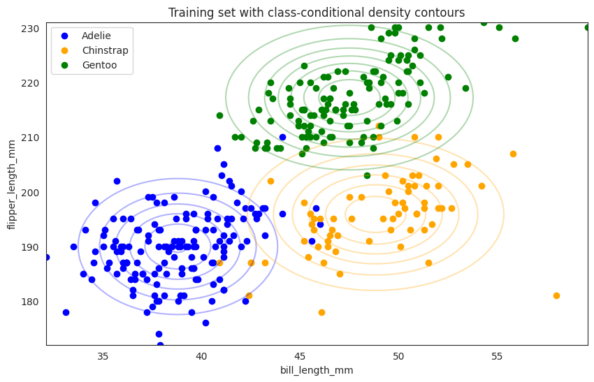
So the above contour plot represents each class conditional distribution, for example,
the blue dots are Adelie with bill_length_mm on the x-axis and flipper_length_mm on the y-axis and the contour is a 2d visualization of the joint distribution of bill_length_mm and flipper_length_mm given Adelie (\(\mathbb{P}(X_1, X_2|Y=A)\)) where the
contour represents a multi-variate Gaussian distribution with mean and covariance matrix,
in particular the covariance matrix is a diagonal matrix since we assume the features are conditionally independent given the class label.
Of course the real data points (blue scatters) are not exactly on the contour, since
there is no reason to believe that Adelie’s bill_length_mm and flipper_length_mm are exactly Gaussian distributed with such mean and covariance matrix.
Further Readings#
JOHNSON, ALICIA A. “Chapter 14. Naive Bayes Classification.” In Bayes Rules!: An Introduction to Applied Bayesian Modeling. S.l.: CHAPMAN & HALL CRC, 2022.
https://www.kaggle.com/code/parulpandey/penguin-dataset-the-new-iris