From Discrete to Continuous
Contents
Using Seed Number 1992
From Discrete to Continuous#
Calculus#
The following content is adapted from [Orloff, n.d.].
Conceptually, one should know that the two views of a definite integral:
The area under the curve given by \(\int_a^b f(x) dx = \text{area under the curve } f(x) \text{ between } a \text{ and } b\);
The limit of the sum of the areas of rectangles of width \(\Delta x\) and height \(f(x)\), where the rectangles are placed next to each other, starting from \(x=a\) and ending at \(x=b\). Essentially, this means \(\int_a^b f(x) dx = \lim_{n \to \infty} \sum_{i=1}^n f(x_i) \Delta x\) where \(\Delta x = \frac{b-a}{n}\) and \(x_i = a + i \Delta x\).
The connection between the two is therefore:
And as the width \(\Delta x\) of the intervals gets smaller, the approximation becomes better.
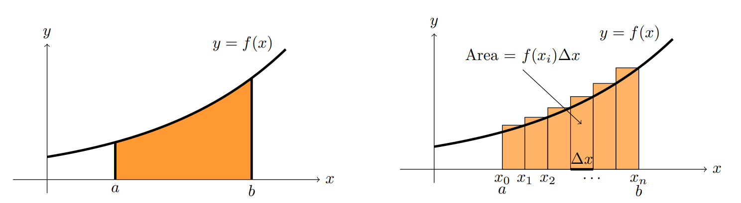
Fig. 6 Area is approximately the sum of rectangles. Image credit [Orloff, n.d.].#
Note
As mentioned in [Orloff, n.d.], the interest in integrals comes primarily from its interpretation as “sum” and to a much lesser extent from its interpretation as “area”.
Probability Density Function#
PDF is not Probability#
Let’s say a well know Expoential distribution with rate parameter \(\lambda_1 = 0.5\) and \(\lambda_2 = 2\) respectively, then their PDF is as follows.
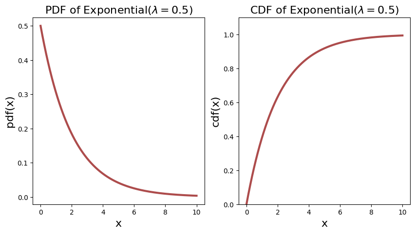
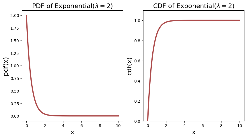
Notice immediately that for the \(\lambda_2 = 2\), the PDF starts off at \(2\). This already tells you that PDF is not probability, as it is more than \(1\).
One might wonder why you cannot define the probability of a continuous random variable as the sum like their discrete counterparts. Like, if the domain/sample space is from \([0, 10]\), why don’t we just sum up the probability of all the points in the domain?
The simple answer is that the domain is infinite, and therefore the sum is infinite. Henceforth, in continuous distribution, the probability at a point is defined to be \(0\).
Probability at a Point is Zero#
Let’s give an informal proof.
Assume that the probability at a point \(x_i\) is given by \(\P \lsq X = x_i \rsq = p_i(x)\), then the probability of the entire domain is given by \(\sum_{i=1}^n p_i(x) = \infty\), a contradiction because by the Probability Axiom Axiom 2. is \(1\).
This does not help build up intuition, because if we use the “summing” idea to approach the problem, we will be stuck because one cannot convince oneself that the sum is infinite, and not \(1\).
The misconception is that we need to use the idea of “summing” in terms of integration.
Probability at a Point in a Small Neighborhood#
As Aerin Kim intuitively pointed out, the probability of a point is not \(0\), but rather \(0\) in the limit.
So, if we take a small enough neighborhood around \(x\), say the interval \([x, x+\Delta x]\), or equivalently, \([x, x + dx]\) or \([x, x + \delta]\), then the probability of the point \(x\) can be approximated by the area under the curve in that interval.
Therefore, if \(\Delta x\) is small enough, then we can approximately say that \(\P \lsq X = x \rsq\) is the area under the curve between \(x\) and \(x + \Delta x\).
She further mentioned that the probability density at a point \(x\) signifies how dense the probability is around \(x\) in the small neighborhood.
Warning
In this section, we are talking about the probability density at a point, and try to interpret it as the area under the curve in a small neighborhood. We have not formalized the idea with integration, which we will do so in the next section.
Example Walkthrough#
This example below is modified from a problem set in Singapore’s Junior College notes.
The masses of 200 six-month-old babies are collected. To visualise the distribution of the mass of a six-month old baby (which is a continuous random variable), let us for a moment treat this 200 data points as the probability distribution1 of all the babies’ masses.
Then, we can say that \(X\) is a random variable that represents the mass of a (randomly drawn) baby.
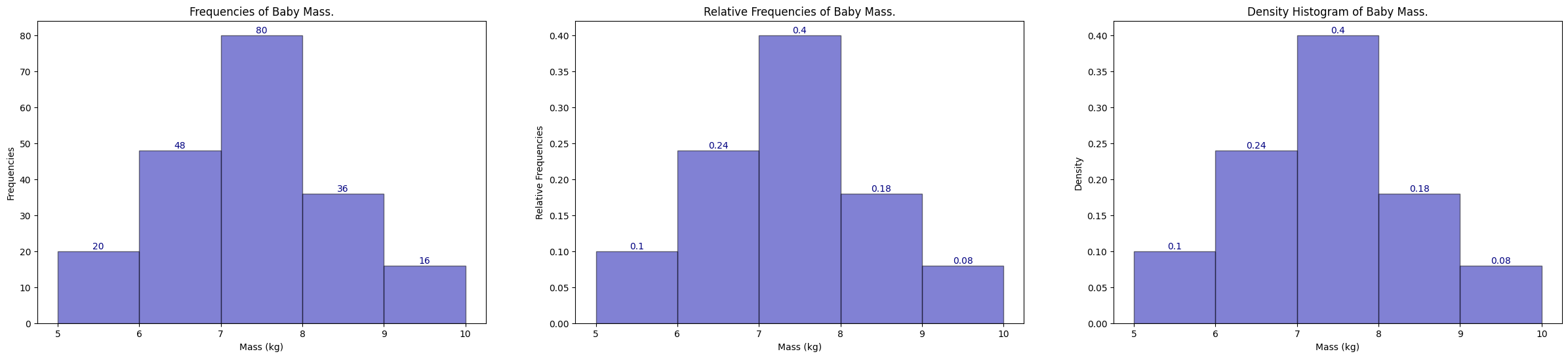
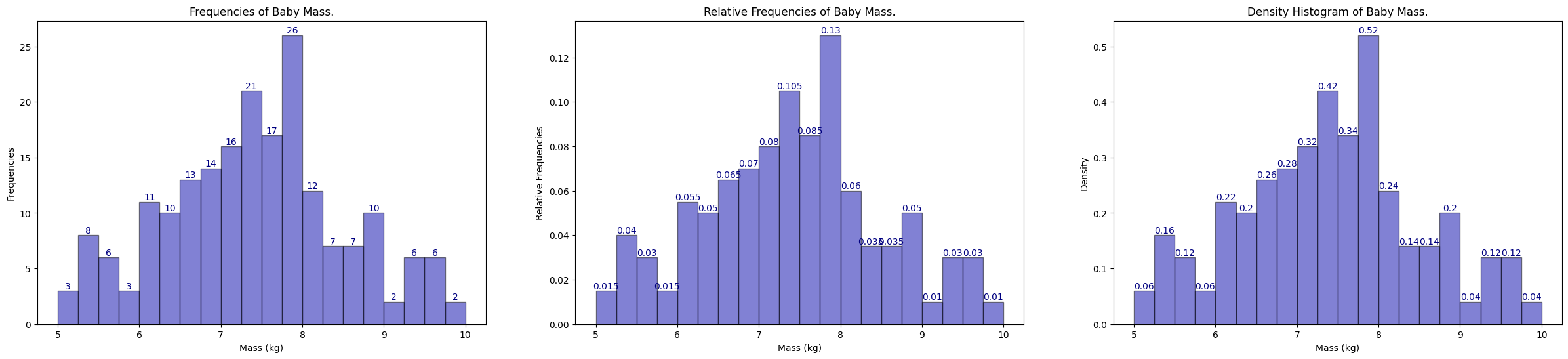
We can then group the data into 5 classes with a class width of 1 kg each. The frequency table and the histogram corresponding to the data Baby Mass Frequency Table are shown below.
\(x\), Mass (kg) |
\(5 \leq x < 6\) |
\(6 \leq x < 7\) |
\(7 \leq x < 8\) |
\(8 \leq x < 9\) |
\(9 \leq x \leq 10\) |
|---|---|---|---|---|---|
Frequency, \(f\) |
20 |
48 |
80 |
36 |
16 |
1# generated bins of data from 5-10
2bin_56 = np.random.uniform(5, 6, 20)
3bin_67 = np.random.uniform(6, 7, 48)
4bin_78 = np.random.uniform(7, 8, 80)
5bin_89 = np.random.uniform(8, 9, 36)
6bin_910 = np.random.uniform(9, 10, 16)
7population = np.concatenate((bin_56, bin_67, bin_78, bin_89, bin_910))
If we plot out their histograms with bin size of 1, from 5-10 inclusive, we recover the following histogram.
In the frequency histogram on the left, we can say that,
20 babies with mass between 5 and 6;
48 babies with mass between 6 and 7;
80 babies with mass between 7 and 8;
36 babies with mass between 8 and 9;
16 babies with mass between 9 and 10.
In the relative frequency in the middle, we can say that,
\(\frac{20}{200} = 0.1\) babies with mass between 5 and 6;
\(\frac{48}{200} = 0.24\) babies with mass between 6 and 7;
\(\frac{80}{200} = 0.4\) babies with mass between 7 and 8;
\(\frac{36}{200} = 0.18\) babies with mass between 8 and 9;
\(\frac{16}{200} = 0.08\) babies with mass between 9 and 10.
In the density histogram on the right, we first define the density histogram so that the area of each rectangle in the histogram is equal to the relative frequency. In other words, the width \(w\) (interval) of each bin multiply by the height \(h\) (density) gives the area of the rectangle, and consequently the relative frequency of the bin. So to recover the density value \(h\), we divide the relative frequency by the width \(w\).
\(\frac{20}{200} / 1 = 0.1\) babies with mass between 5 and 6;
\(\frac{48}{200} / 1 = 0.24\) babies with mass between 6 and 7;
\(\frac{80}{200} / 1 = 0.4\) babies with mass between 7 and 8;
\(\frac{36}{200} / 1 = 0.18\) babies with mass between 8 and 9;
\(\frac{16}{200} / 1 = 0.08\) babies with mass between 9 and 10.
In this case the density histogram is the same as the relative frequency histogram, which is not the case in general (we will see later).
 1def plot_histogram(population: np.ndarray, bins: int, show_labels: bool = True, save: bool = False) -> None:
 2    """Plots histogram of population data for baby mass in kg."""
 3    fig, axes = plt.subplots(1, 3, figsize=(30, 6))
 4
 5    values, bins, bars = axes[0].hist(
 6        population,
 7        density=False,
 8        bins=bins,
 9        color="#0504AA",
10        alpha=0.5,
11        edgecolor="black",
12        linewidth=1,
13    )
14
15    axes[0].bar_label(bars, fontsize=10, color="navy")
16    axes[0].set_xlabel("Mass (kg)")
17    axes[0].set_ylabel("Frequencies")
18    axes[0].set_title("Frequencies of Baby Mass.")
19
20    values, bins, bars = axes[1].hist(
21        population,
22        density=False,
23        bins=bins,
24        color="#0504AA",
25        alpha=0.5,
26        edgecolor="black",
27        linewidth=1,
28        weights=np.ones_like(population)
29        / len(population),  # this allows matplotlib to show as relative frequency
30    )
31
32    axes[1].bar_label(bars, fontsize=10, color="navy")
33    axes[1].set_xlabel("Mass (kg)")
34    axes[1].set_ylabel("Relative Frequencies")
35    axes[1].set_title("Relative Frequencies of Baby Mass.")
36
37    values, bins, bars = axes[2].hist(
38        population,
39        density=True,
40        bins=bins,
41        color="#0504AA",
42        alpha=0.5,
43        edgecolor="black",
44        linewidth=1,
45    )
46
47    axes[2].bar_label(bars, fontsize=10, color="navy")
48    axes[2].set_xlabel("Mass (kg)")
49    axes[2].set_ylabel("Density")
50    axes[2].set_title("Density Histogram of Baby Mass.")
51
52    if save:
53        fig.savefig('plot.png', dpi=300)
1bin_interval = 1
2bin_start = 5
3bin_end = 10 + bin_interval
4
5bins = np.arange(bin_start, bin_end, bin_interval)
6plot_histogram(population, bins, save=False)
We try to link back how a density histogram can connect to PDF and its integral. Let \(X\) be the continuous random variable defined earlier.
The area under a density histogram is 1, this follows because the relative histogram must add to 1.
The area represents how dense the population is at that particular interval/bin. The larger the area, the denser the population is (think density).
For each interval/bin, the area inside that rectangle is simply the relative frequency (i.e. \(\text{width of interval} \times \text{density}\)).
Therefore, we can think of it this way, the area inside each interval/bin is the probability of \(X\) being in that interval.
Consequently, we can define \(\mathbb{P} [a < X \leq b]\) to be the area inside the interval between point a and b, i.e. \(\mathbb{P} [a < X \leq b] = (b-a) \times \text{density}\)
Note we defined this without the usage of integrals.
Now this definition seems quite coarse because we are only restricted with a fixed interval, i.e. bins 5-10 with only 1 width, and we can only find cases for these discretized bins.
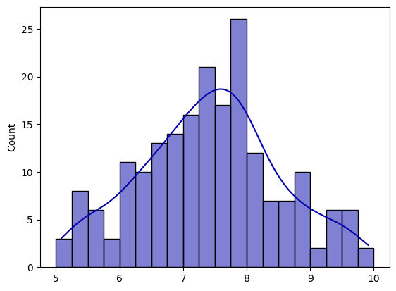
What if we want to find \(\mathbb{P}[5 < X < 5.25]\)? Well, we can discretize our bins further to have 0.25 intervals (width)!
1bin_interval = 0.25
2bin_start = 5
3bin_end = 10 + bin_interval
4
5bins = np.arange(bin_start, bin_end, bin_interval)
6plot_histogram(population, bins, save=False)
Before we move on, we take note that in the relative frequency diagram, the y-labels must sum to 1, but this will not be true here in the density diagram. Recall relative frequency is density multiplied by bin width (i.e. in the bin 5 to 5.25, we have \(0.06 \times 0.25 = 0.015\).
Now the problem is that all the bins are discretized, and hence does not fit the definition of continuous, we can keep ask for a smaller interval on the real line (i.e. what is \(\mathbb{P}[5.00000001 < X \leq 5.00000002]\)). Then we have to keep shrink the bin width to recover the area of the rectangle in order to recover the relative frequency (probability).
Define the number of bins to be \(k\), and the width of a bin to be \(\frac{5}{k}\) where \(5\) is \(10 - 5\), then we can solve this problem by letting \(k \to \infty\), this will eventually smooth out the whole histogram into infinitely number of bins and recover a smooth function \(f\), which turns out to be our PDF.
We can simply use seaborn to plot both a histogram and kde (with its distribution smoothed).
 1# for the same 20 bins
 2bin_interval = 0.25
 3bin_start = 5
 4bin_end = 10 + bin_interval
 5
 6bins = np.arange(bin_start, bin_end, bin_interval)  # 20 bins
 7
 8sns.histplot(
 9    population, kde=True, bins=bins, color="#0504AA", alpha=0.5, edgecolor="black"
10)
11# plt.savefig("sns_plot.png", dpi=300)
<AxesSubplot: ylabel='Count'>
We now ask, what exactly does PDF mean at a point \(x\) mean, in other words, if \(f_X(x)\) is not the probability, then what is it? We established that the probability at a point \(x\) is \(0\), because integrating over a point (line) gives 0 (also can prove by contradiction by summing up infinite number of bins).
But to me it does not make sense if this number has no meaning. The textbook says that \(f_X\) at a point \(x\) is the “probability mass per unit length2 around \(x\) within a small neighbourhood \(\delta\)”.
This means that if we define an infinitesimally small interva epsilon \(\delta\) around \(x\) (here we would just use \(x^{+}\)) to \(x\), we have an interval \((x, x+\delta]\). We then ask ourselves the probability between this interval, which is \(\mathbb{P}[x < X \leq x + \delta]\).
Now recall we have showed earlier that we can approximately interpret integration as sums, and this is now connected to the histograms we plotted. If the interval/bin width is very small, then we can say that the probability of this interval is \(\mathbb{P}[x < X \leq x + \delta] \approx \delta f_X(x)\). Note carefully that the interval must be small, if not the “area” won’t be close to the probability as seen in Fig. 7.
Rearranging will get me:
Then we can see that the PDF at a point \(x\) is the probability per delta, which translates to the probability mass per unit length around \(x\) within the small neighbourhood \(\delta\). One can think of it as how densely packed \(f_X\) is around the point \(x\), if \(f_X(x)\) turns out to be larger than the rest, this means that the probability of occurring at that point (and its neighbourhood) is larger than the rest. More concretely, for the same interval length \(\delta\), a larger \(f_X\) means the probability is higher.
Furthermore, the probability density function can be greater than 1, as long as it obeys that the area under the curve is 1.
Note that the above did not mention about the definition of \(f_X\) in terms of integrals, we complete the intuiton as follows:
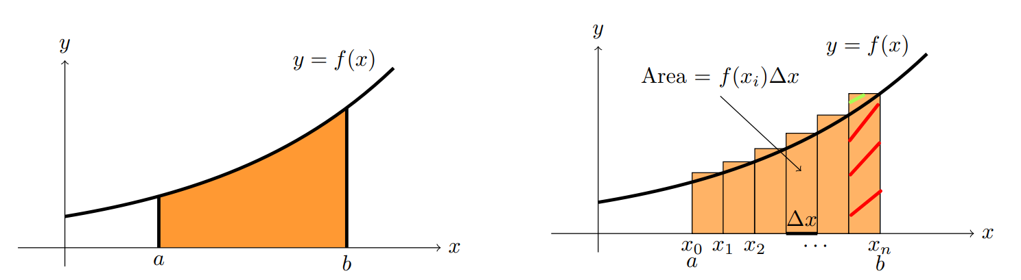
Fig. 7 Notice that in the last interval, the interval is too large and therefore the approximation is not good. The one shaded with red is the actual area under the curve between the interval \([x_{n-1}, x_{n}\) where as the rectangle area (includes the green line) will over approximate.#
Further Readings#
Chan, Stanley H. “Chapter 4.1. Probability Density Function.” In Introduction to Probability for Data Science, 172-180. Ann Arbor, Michigan: Michigan Publishing Services, 2021.
Pishro-Nik, Hossein. “Chapter 4.1.1. Probability Density Function (PDF)” In Introduction to Probability, Statistics, and Random Processes, 226-230. Kappa Research, 2014.
Is my interpretation of Probability Density Function correct?
Would it be accurate to describe a PDF as a probability mass per unit length?
“The total area underneath a probability density function is 1” - relative to what?